
During our Week of Colour we have explored 5 colour strategies and shared many more than 5 knits. We’ve had a blast playing with colour and sharing some of our findings with you!


In order to create these knits, we used the swatch hat and cowl pattern from Strange Brew to try our wacky and wonderful combinations. Of course, I saved the best for last and this is Fair Isle Friday!

What is Fair Isle knitting?
Fair Isle is one of the islands in Shetland, an archipelago northeast of the Scottish mainland. A colourful style of stranded knitting was developed there in the 1800s which spread quickly to the rest of Shetland. It was taken up both as a craft and cottage industry, which has grown and developed to the current day.
The hallmarks of the Fair Isle style are:
- Use of patterns that are symmetrical – often both vertically and horizontally.
- All-over garments and accessories typically combine little patterns of up to 7 rows (called peeries), with mid-size patterns of 9-13 rows (called border patterns) and larger patterns.
- Patterns use two colours at a time in a given row, and employ shading, where both background and foreground colours are changed (typically in a symmetrical manner) over the rounds of the pattern.
- Often the centre row is given special attention with a brilliant or high-contrast colour or combination.
What kind of yarn can I use for Fair Isle designs?
In Shetland, yarns are dyed and blended into a truly VAST array of shades, which support the sophisticated blending seen in contemporary Fair Isle design. The 4-ply ranges of Jamieson’s of Shetland include over 220 colours, and Jamieson & Smith have around 100 colours. This makes for an extravagant painter’s palette of colours that really work well together.
By contrast, many yarn lines that you may find at your local shop have in the range of 10-25 colours (so you won’t have 14 different greens to choose from!). For this reason, and for the simple practicality of using what I have in stash, I like to combine yarns across brands and types.
The hat that I made uses:
– Zealana Heron in ‘dark brown’ (worsted weight)
– John Arbon Viola in ‘cinnamon’ (DK weight)
– Madelinetosh Tosh DK in ‘nassau blue’ (DK weight)
– Baa Ram Ewe Dovestone DK in ‘parkin’ (DK weight)
– Madelinetosh Tosh Sport in ‘button jar blue’ (sport weight)
– Ginger’s Hand Dyed Sheepish DK in ‘curry night’ (DK weight)
– Madelinetosh Tosh DK in ‘candlewick’ (DK weight)

We used a sport weight and a worsted weight in combination with the DK yarns and the hat came out just fine! And as you can see from the detailed photo of the yarns, the yarns are also of different types in terms of construction. So we encourage you to experiment with yarn combinations!

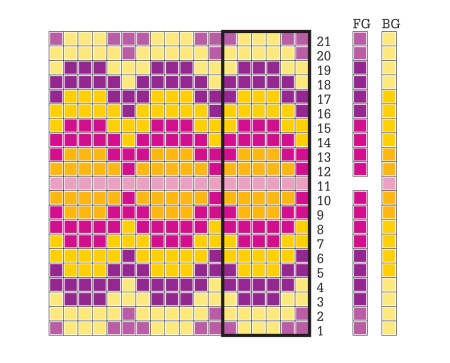
What we want to focus on is not the ‘rules’ of Fair Isle, but the way that a combination of both foreground and background colours can be used to develop a complex ‘blendy’ palette which is rich and fascinating!
How do you create a Fair Isle style blend?
Well, first I pulled out all my DK weight yarns (and some worsted and sport weight too!).
Next I chose the colourwork pattern I wanted to work on the hat.

Then I chose two basic colour families / tonal families (the background vs. the foreground).

For this hat, I decided to use a dark brown main colour. This background blend would shift from brown to golden to bright yellow. Against this chose to work a foreground blend of teals. When you choose your foreground and background palettes, it is important that you have sufficient contrast between colours that are worked alongside one another. Value (relative lightness or darkness of a colour) can be more important than hue (the colour of the yarn) in creating this contrast.

I had initially planned to use 3 different teals. However, as I was working, when I got to the point where I would have changed to the brightest of the 3 teals, I knit with it for awhile, but decided it didn’t ‘pop’ as strongly as I wanted to, and so I worked a brighter yellow in the centre instead.

Some other palettes that might work well:

A blend of reds / pinks and greys with a POP of bright yellow (or another colour) would work beautifully. This is an example of working (mostly) a single hue against a neutral colour. You could swap out the reds/pinks for another hue, for example blue, yellow or green, and the palette would still work.
A purple hat with yellow and golden patterning would be striking. This is an example of complementary colours working well together.

Using greens and blues together is an example of an analogous colour palette, because green and blue are next to each other on the colour wheel. The central rows of the motif (rows 7-15) are worked in the more bright and saturated tones to call attention to the centreline of the pattern.
What can our example teach you?
It is useful to get started with a set of assumptions, but be ready to shift course once your pattern is on the needles. While our Week of Colour posts can give you a set of strategies and rules of thumb for developing effective colour combos, you will really learn how the colours and yarns interact when you have them on the needles together.

This uncertainty is both the most inspiring and most frustrating aspect of colourwork knitting! In a sense, every colourwork knit you create is your own design, as you’ve made a creative set of decisions (and often design trials) to arrive at the finished piece. For example, each of the hats above was made using the same pattern, but they are all quite different in finished appearance, because I chose different stitch patterns and colour palettes!
The Fair Isle blend colour strategy possibly requires the most experimentation, learning, and thought of all 5 we’ve discussed during the Week of Colour. But in a way, this strategy is no more difficult… assuming you’ve got a lot of yarn in hand, or some time to meditate on colour at your local yarn shop!
Are you ready to get more experimental with colourwork? Alexa and I can point you towards the right resources, answer your questions, and keep the inspiration flowing – Get our excellent email updates.

Mountain Mist

Dog Star

Marshland

Compass

Fleet

Anthology Hat (free!)


January 30, 2018 @ 7:24 am
These hats are beautiful
October 22, 2017 @ 2:24 am
Ooh gorgeous! Love this post, you have inspired me to use up some random skeins of worsted and DK I have hanging around. Is the swatch hat pattern included in the Strange Brew sweater pattern?
October 20, 2017 @ 2:16 pm
Thank you so much for this week’s posts. So inspirational. I wonder if you could answer a question..when knitting colourwork in the round, do you just continue each new row with knit stitches or do you pick up the stitch below to address the jog?
October 23, 2017 @ 7:42 am
We just start the next row with a regular knit stitch, and don’t worry about the jog.
October 23, 2017 @ 7:48 am
Thank you! That’s really useful to know as your knitting always looks perfect.
October 20, 2017 @ 8:14 am
Hi! Just wondering what program you use to create your color charts, they look great!
October 23, 2017 @ 7:43 am
Thanks for the compliment, we use Adobe Illustrator!