

sunshine sweater 
sunshine hat
Whether you’re planning a Sunshine sweater or hat – or planning to use the hat as a swatch for the sweater – let’s take a look at how this playful colourwork design works! Understanding the nature of a colourwork pattern and analyzing its structure and relationships can help you modify the colour palette to suit your preferences and yarn stash. Grab your copy of the Sunshine sweater or Sunshine hat pattern, and let’s get started!
While the Sunshine sweater and hat can be worked using either a light or dark main colour (MC), we’ll analyze the dark MC palette in this tutorial. See how the pattern reads differently with a dark vs. light MC? This is just another way colourwork knitting is a playful joy!


Colourwork palette notes
In the Sunshine sweater and Sunshine hat patterns, we included something NEW: a palette notes section. Palette notes describe the relationships between the colours in the design. We hope this helps you select colours with a little more confidence. If the colour terms used here (like hue, contrast, and saturation) are unfamiliar to you, read Colour Theory for Knitters. Remember that MC means main colour, and CC means contrast colour.
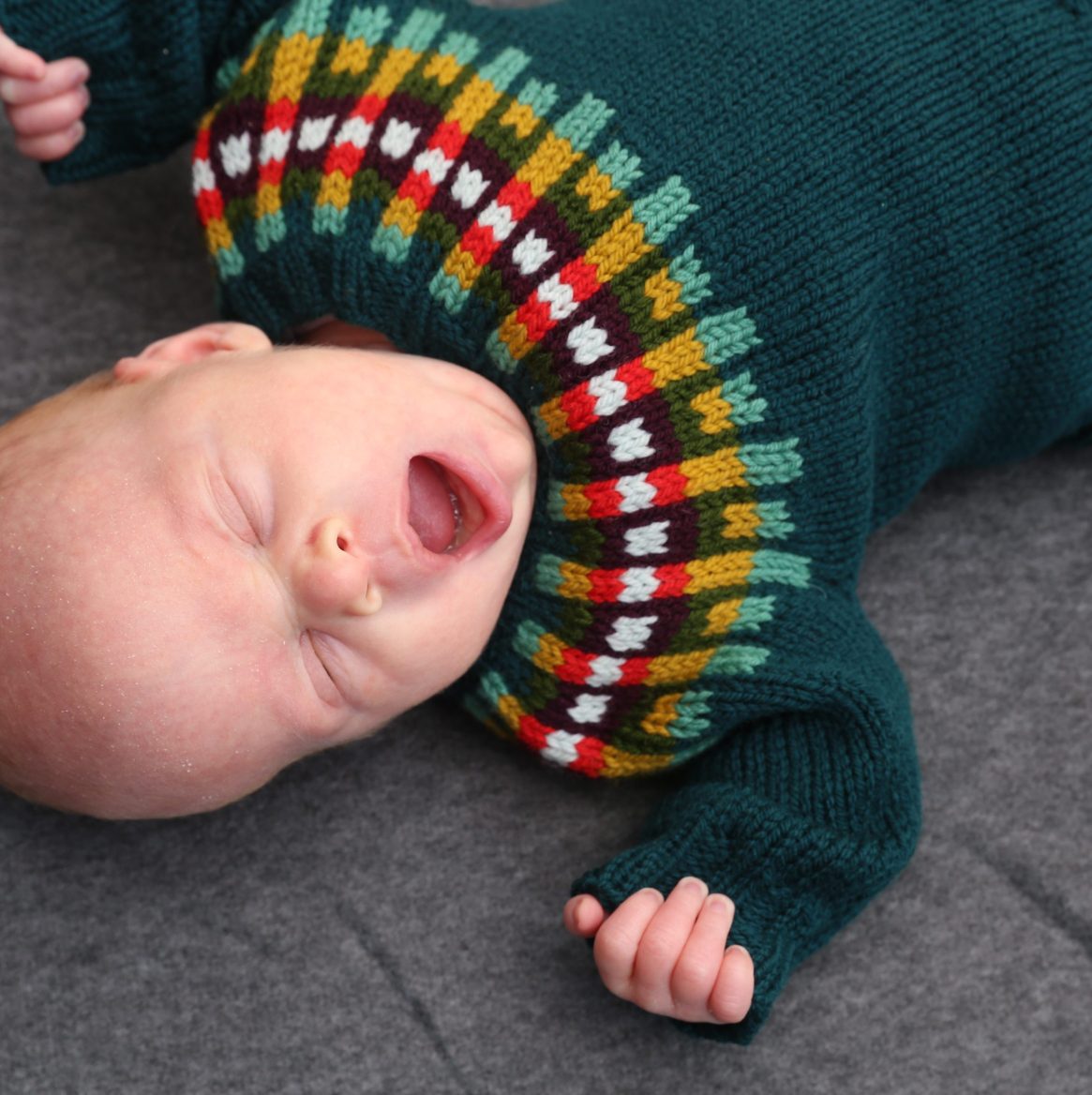
Palette A notes (dark MC):
- MC (dark) and CC1 (light) are two shades of the same colour.
- CC2 (dark) and CC3 (light) are also two shades of the same colour.
- CC4 is darker than CC5; the saturation and contrast of the palette through the central 6/8 rounds should increase.
- CC6 should be a colour with strong contrast that really ‘pops’ against the other CCs.


Take a look at the hat in colour, as compared to black and white. When you view the photo (or the chart) in black and white, it becomes clear how the overall pattern is formed from primary columns with dotty columns between them, and how the CCs stack up light over light, and dark over dark, to create these columns.

How to choose a colour palette, step-by-step
Tip your box of yarn odds and ends out onto the floor. Grab the sport, DK, worsted, and even aran weight yarns, and get ready to have some fun! Sunshine is designed for DK weight yarn, so your MC should be DK weight; however, this project is great for combining yarn weights within the colourwork pattern. It works (trust me and try it!).
First, select your MC and then choose CC1, which will be a lighter shade in the same (or similar) hue as the MC.

Second, select CC2 and CC3. These should also be dark and light shades of the same or similar hue. I prefer a strong contrast between the MC/CC1 hue and the hue used for the CC2 and CC3 pair. In other words, make it interesting – don’t just use another two blues!

Third, select CC4 and CC5. In this case, I used a lighter and a darker colour, but I chose hues from different colour families. In the sweater palette, I used a vivid red as CC4 (darker) with vivid yellow as CC5 (lighter). The saturation and contrast of the colours in this section are increasing, as mentioned in the palette notes.

Fourth, select CC6. The key here is to choose a colour that really ‘pops’ and contrasts strongly with both CC4 and CC5. You can see in the palettes I designed that I used a new hue (a totally new colour family) that hadn’t been used in the palette so far.

Are you ready to get creative?
For me, the joyful thing about playing with colour in this way is that it makes me feel incredibly creative, even though I only have to make a few choices. I simply need to be willing to experiment, and a hat isn’t too much of a commitment, really. And I love it when I can adventure a little bit outside my ‘comfort zone’ to seek a combination that really pleases me.
Which is your favourite of these colour combinations – one of the hats or one of the sweaters? What colour combinations will you try? Let us know in the comments!
~ Emily


September 4, 2021 @ 12:05 pm
They are all lovely, but I actually think the combination on the yoke of the little baby sweater is my favorite!
August 31, 2021 @ 8:47 am
FANTASTIC post!!!!! Thank you so much! I will be referring to this post for many colorwork projects.