
Because we love an ombre…
Are you a collector of ombre mini-skein sets? Do you love blue so much that your entire stash is blue? Well when it comes to creating colourwork projects, tonal combinations are often an easy win!

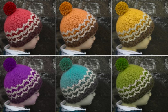
Just like Monochrome Monday’s hat, this hat is worked following the swatch hat pattern included with the Anthology hat and cowl recipe. I made the child size, and worked an ombre of reds with a cream foreground.
This post is the second in our 5-part Week Of Colour! Check out the other posts too:


To help in planning my ombre I pulled out my DK weight yarn stash. In fact, I included some lighter worsted weight yarns, and some sport weight yarns too, because I find you can usually combine across yarn weights fairly successfully in colourwork.

I decided to aim to work with an ombre of red, and then choose a single contrast colour that would work well with all the tones.
 To make this hat, I used the swatch hat pattern included with the Anthology hat and cowl recipe, and worked the chart shown below.
I used 4 red tones, and a warm cream as the contrast: Zealana Heron Worsted in ‘h07 carnival’, Fleece Artist BFL Sport in a brick red colour, SweetGeorgia Superwash DK in ‘blood orange’, and Shibui Baby Alpaca in peach, and chose Blue Sky Fibers Baby Alpaca (Melange) in ‘toasted almond’ as the warm cream. As you can see, I’ve used a worsted weight, a couple of sport weights, and some DK weight too! It all plays pretty nicely together.
Testing Colour Combinations
To test my ombre, I folded up a bit of card, and wrapped the yarns I was considering around it, in order from dark to light. At first I thought I’d use the purply red, rust red, then a salmon. But then I tried wrapping a bright orangey red over the salmon, and it looked to me like it should be included too.

Wrapping yarns in this way around a card is a great technique to trial out colourwork without knitting – it’s fast, doesn’t use much yarn (and in fact, you don’t even need to cut the yarns, as I have).
Ombre chosen, I proceeded to consider the contrast colour. My plan was to use the reds as the background colour, and have the foreground of the pattern worked in a lighter / brighter contrast colour that would POP out against the reds. So that meant a light / bright colour was called for. So I photographed each of my options laid across the ombre of reds, for consideration.


After taking a look at all the photographs, I decided that cream or pale grey would most definitely work. The goal was to keep this knit simple and easy to duplicate for knitters who wanted to employ a similar strategy but swap out the ombre. Next time I plan to try knitting it with the icy pale blue, or bright golden yellow!

An ombre can either form the background colour, or the foreground colour. In the example hat I made, the cream is the foreground colour, and the ombre of reds the background. The critical point to keep in mind is that each of the colours within the ombre need to have a strong contrast with the main colour against which they are placed. Confused by colour terminology like contrast? Review our post on Colour Theory for Knitters.

This hat would look pretty great in other ombre combinations, I think!
You don’t have to stick to a single hue, and use only lighter or darker (or saturated to desaturated) versions of that colour. Your ombre could also shift from one hue to another. Many hand-dyers and mills create exquisite gradually changing yarns, that in themselves might inspire your ombre colour choices.

You can also work one ombre against another, like I’ve shown in the example above. We’ll talk more about this when we get to Fair Isle Friday!
Enjoying these colourwork resources? Alexa and I LOVE colourwork… and we wanna share this love! We can answer your questions, help you find the resources you need, and share what’s inspiring us if you sign up for our free email updates.

Mountain Mist

Dog Star

Marshland

Compass

Fleet

Anthology Hat (free!)


October 17, 2017 @ 2:56 pm
Thank you for all this teaching about colour. It is appreciated